Monday, December 9, 2013

Glen Magna Designer's Holiday Showhouse

Last night I had the honor of visiting The Designer's Holiday Showhouse at Glen Magna Farms in Danvers, MA during a special guided tour for design bloggers. The Endicott Mansion at Glen Magna Farms is a property that is known for its spectacular gardens in the spring and summer and is also home to the Derby Summer House, a historic landmark designated by the United States Department of the Interior. The showhouse is a fundraiser to help with the restoration of the Derby Summer House.

Not only were the spaces in the mansion redesigned, they were also wearing their best holiday decorations!  From garland bedecked staircases to bathtubs filled with Christmas ornaments, the mansion sparkled in holiday finery!

The Designer's involved not only had to redesign and redress the rooms, but also had to put a holiday spin on them - all in only a month!!  As you know from my previous posts, it took us three months to design the space for the York Showhouse, and we slid in just under the wire!  There was certainly some magic afoot during this showhouse to get it ready for its grand opening!

While I can't show full pictures of the rooms while the showhouse is in progress, I can give you little tidbits to whet your appetites!

First and foremost, I want to give you a sneak peak into my friend Yvonne Blacker's space.  As you may know,  Yvonne was one of my Trio Design cohorts during the York Showhouse.  And God bless her, she decided to jump right back in!!

Yvonne did the Coat Room, Powder Room and Hallway.

Yvonne Blacker of Yvonne Blacker Interiors

Cloaked in a Farrow and Ball wallpaper, the Coat Room is not so much a coat room, but a place near the Powder Room to sit and chat and take a break from the festivities going on in the main rooms!

Coat Room by Yvonne Blacker Interiors
In the Powder Room, a surprise awaits in the corner, as Yvonne skillfully transformed a plumbing pipe to be incorporated in the room's design!  You will have to visit to see more or check out her blog at Design Vignettes.

The first room we were introduced to is the Drawing Room by Donna Terry of Boston Design and Interiors, Inc.  A room on a grand scale, it was divided into two separate areas - one side focusing on the carved fireplace surround that the owners brought back from Egypt.  The other side was anchored by a luxuriously draped table and chairs.  The room comes alive with a nod to the styles of the Art Deco period, with "Neoclassical and Egyptian Revival roots".  Though the scale of the room was very large, Donna brought it all together with a cozy, inviting feel.

Boston Design and Interiors, Inc. - Donna Terry

Another room that caught my eye, was the Endicott Library by William Ralph.  William told us tales of the pieces in the room and his reason for selecting them.  The stand-out feature in the room was a large curved bookshelf wall that owed it's shape to the curved stairway on the other side.  The room was originally painted in a red, with a sea-blue trim.  Since it was one of the owner's favorite colors, Mr. Ralph was asked to keep the colors as is.  In the end, the Historical Society relented and he was able to paint over the red, while keeping the blue.  A wise decision as the room is now a peaceful retreat to curl up with a good book!
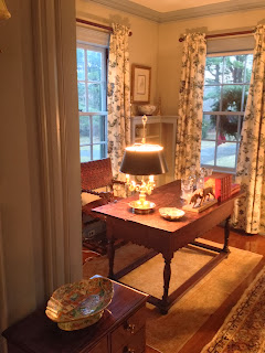
Endicott Library by William Ralph

My favorite room in the house, by far, was the Bride's Room by i-Design Interior Design Solutions Linda Hentschel.  The Endicott Mansion is currently being used as a function hall with weddings topping the list of events that are held there.  Linda created a classically styled, frothy white boudoir that any bride, (and any woman) would be honored to stay in.  And if it was me, I would never leave!  The cornice boards over the curtains are a stand-out feature and Linda used her own wedding gown that was lit from within, to complete the look.  Linda, this is one for the magazines!!

Brides Room by Linda Hentschel of i-Design

There were so many other wonderful spaces by fabulous designers in this showhouse, but you will have to visit to get the full experience.   Special recognition should go to Sandra Biondo, Chairwoman of the event,  and the staff at the Danvers Historical Society for pulling this all together in record time and during the busy holiday season!  Sandra, you really are a wonder woman!

 I urge all of my readers in the Boston area to come out and visit the Danvers Historical Society Presents "A Designer's Holiday Showhouse Fundraiser".  But hurry - the show will only run until December 15th, 2013.  Not only will you be supporting the talented Designer's whose work deserves to be seen, but you will also be supporting the preservation of a treasured North Shore landmark.


Monday, August 19, 2013

SHOWHOUSE - The Reveal and the Goodbye

The magic is gone.  The "Secret Cove" Designer Showhouse closed its doors on Thursday for the last time.  Today was the breakdown.  You spend so much time in your space that you come to think of it as your own, so to see it all stripped of its finery, is like losing a friend...or leaving home for the last time. (Big sigh....)

As promised, if you didn't get to experience "Secret Cove" in person,  here are the before and after photos of the spaces my Trio Design cohorts and I transformed.  Premier interior and architectural photographer, Eric Roth, took two of the "after" photos.  Thank you Eric for your beautiful work!

                                                                           " THE MUDROOM" - Before


                                                    The transformation to "THE POOLSIDE PORTAL"

"Poolside Portal" - Photography By Eric Roth

                                                                            Before...


                                                                        After!

"Poolside Portal" - Photography by R. Palazola

"Poolside Portal" - Photography by R. Palazola

                                                                       Before...


                                                                        After!

"Poolside Portal" - Photography by Eric Roth

                                                                        Before...


                                                                        After!

"Poolside Portal" - Photography by R. Palazola

Yvonne Blacker designed the Petite Powder Room, or the "Jason Wu Loo" as I like to call it!  It's a tribute to the style of designer Jason Wu - very glam!!  Yvonne changed a extremely small, non-descript space into one of the most dramatic areas of the Showhouse!

                                                                        Before....


                                                                and  TA DA!!!!

"Petite Powder Room" - Photography by R. Palazola

 
"Petite Powder Room" - Photography by R. Palazola

"Petite Powder Room" - Photography by R. Palazola

Yvonne also worked her magic on "Syrena's Bath" - every teenage girl's dream!  A bath she doesn't have to share!

                                                                        Before.....


                                                                         After!

"Syrena's Bath" - Photography by R. Palazola

 
"Syrena's Bath" - Photography by R. Palazola


And last, but certainly not least - "Syrena's Bedroom" - designed and styled by Katherine Hawkins - The perfect bedroom for a teenage girl with a love of mermaids and the sea!

                                                                          Before...


                                                                        And the finale.....!

"Syrena's Room" - Photography by R. Palazola

"Syrena's Room" - Photography by R. Palazola

"Syrena's Room" - Photography by R. Palazola

And so, like all good things, it must end.  The clock has struck midnight and my Poolside Portal is once again a Mudroom.  As I close the door for the last time,  I can almost hear her say "thank you for taking me to the Ball".


Wednesday, August 7, 2013

SHOWHOUSE: A Fly On The Wall...

As you may know from previous posts, the York Designer Showhouse is now in it's second to last week and we will soon have to wrap up.  I know, I know....I still haven't shown the final pictures....I will only torture you this one last time before the final reveal.

We started off the day with a luncheon at the York Harbor Reading Room - a charming restaurant on the coast with lovely gardens and beautiful views!  Prior to the luncheon, we were treated to a panel discussion from four of the designers who worked on the house - Chris Chapin and Sara Lee from Company C,  Ann Cowenhoven, Barbara Hirsch, and Pauline Vastardis.  All talked about their inspiration for their spaces and their experiences executing their designs.  A fabulous summer lunch followed!

York Harbor Reading Room - photography by R. Palazola

After the luncheon, I spent some time at the Showhouse.  One of my favorite things to do is be a "fly on the wall"!  I hover around the spaces and listen to the comments.  And the good thing is, I have not heard one negative comment yet!!  After a couple of minutes of eavesdropping, I step in and introduce myself and see if the visitors have any questions!  I found two older women who were picking up the fabric on my skirted table and were examining what was underneath!  I didn't have the heart to tell them that they weren't supposed to touch!  Seems like the two items in the "Poolside Portal" that are generating the most interest are my window curtain and my chandelier!

The window curtain is a very simple white mesh fabric with turquoise, jade and crystal beads strategically sewn on.  The curtain is covering the window of a door that leads to the outside pool area (hence the name "Poolside Portal".)  The view was too beautiful to cover up, but the window needed some dressing as it's the first thing you see when you walk into the space.  The mesh allows the light and filtered view in, and the beads give it a little detailing.  Unfortunately, it is very hard to photograph during the day, but hopefully I will have a photo soon!

The other item of interest is the chandelier!  It's an open work, white metal frame with glass drops made from recycled Coca Cola bottles.  Reuse, recycle and repurpose!!  If you remember those slender green glass bottles, you will appreciate the glass drops on the chandelier!

Photography by R. Palazola

Kind of looks like an atom!  The shadow of the frame and light on the ceiling adds a wonderful glow and pattern!

The chandelier was courtesy of our favorite lighting store, Lucia Lighting in Lynn, MA.  Lucy Dearborn, owner and "proprietress extraordinaire" knows everything there is about lighting! (And she is so much fun!)

Lucy Dearborn - photo pilfered from the internet


  Her shop has a very eclectic assortment of lighting that is traditional, contemporary, whimsical and always very tasteful!  Another aspect I find fascinating about her store - it's a converted funeral home!  One of the first day's I visited the store, an elderly woman came in and was looking around.  She turned to me and said "This is where I waked out my husband.  I just wanted to see what they did with the place."  Ok, maybe a little strange, but there are definitely no bad spirits there!  And Lucy and her staff always make you feel welcome!  Check them out at www.lucialighting.com.

   Eight more days and the 24th Annual York Designer Showhouse closes its doors.  There is still time if you haven't visited!!  http://www.oldyork.org/Visit/showhousepreshow.html

I PROMISE...the next post will be full of before and after pictures of our spaces at the showhouse!!!

Stay tuned!

"To be a star, you must shine your own light, follow your own path, and don't worry about the darkness, for that is when the stars shine brightest." - Unknown.


Friday, July 19, 2013

SHOWHOUSE - THE UNVEILING!!

The 24th Annual Museums of Old York Decorator Showhouse is finally underway!  The "Secret Cove" was unveiled at a Gala Preview Party on July 12th.  Some last minute adjustments had to be made, but by the opening, the spaces were complete!  The transformation is amazing!!  The rooms have come alive and all have their own story to tell!  The talented and extremely creative designers came up with ways to work around "design issues".  Their thinking was totally "outside the box"!  When you go to visit, be sure to look at the "before" photos.  You will do a "double-take", I promise you!


Trio Girls - Katherine Hawkins, Yvonne Blacker, Rosanne Palazola
My Trio Design cohorts all came dressed to include some aspect of each of our rooms! (And no, we didn't plan this!)  Katherine, in the colors of Syrena's room, Yvonne with an aqua that was used in the space I designed and in Syrena's Room, and me in a black print that echos the Petite Powder Room.

So back to the space that was a little bit "green monster" and a lot of "the problem child".  The "Mudroom"  that was neither a room, nor contained mud, now has a new purpose, a new look and a new name - "The Poolside Portal"!  A pass-through space where you can grab what you need for a day of fun in the sun!  The palette of the space consists of seaside brights - the spring green of new blooms in the garden; the greyish white of the clouds outside and the turquoise blue reminiscent of the interior of a pool.  Margaritas?  Books? Sunglasses?  Snacks?  The Poolside Portal has it all!  Including the sunscreen!


I bet you are all anxious to see what the spaces look like after all our hard work!!!  Well, you will just have to come up and visit!  For my out of town friends, I will post plenty of before and afters, AFTER the run of the Showhouse.  Don't want to give it away to any who will see it in person!

But as usual, I can't resist a little tease!  So here are a couple of Pictures of the "Poolside Portal".


A Bowl of Tangerines for a POP of orange!

Sunglasses and reading material

Painting by Tracy Finn Fine Art

Please come up to visit!  Follow this link for schedule and directions.  http://www.oldyork.org/visit/showhouse.html.  I promise a fun day that will get you rethinking your own spaces!

"Live in the sunshine, swim the sea, drink the wild air."  - Ralph Waldo Emerson  (Another tease!)


Sunday, July 7, 2013

SHOWHOUSE - Blue Peacock and the Home Stretch!

Crazy title, huh?  Let me explain...The work is continuing on the Old York Decorator Showhouse that my cohorts,Yvonne Blacker and Katherine Hawkins, and I have been working on since last April.  Painting done - check!  Carpet installed - check!  Bench seat disguised - check!  Furniture placed - check!  Accessories......no check....

The finishing touches have yet to be placed.  I did a bit of shopping beforehand, and even though you think you have more than enough, it usually ends up that you have half of what you need.  What to do....


There is an adorable little shop in South Hamilton, MA.  Blue Peacock Home (BluePeacock.com) has an array of one-of-a- kind home accessories, table top items, soaps, candles, wall art and mirrors, baby gifts and much more. Owner and Interior Designer Susanne Csongor, has artfully arranged her wares so that one pass through her shop isn't enough!  Three visits last week alone and each time I discovered more fabulous items!  Her taste and advice on selections was right on target!  Susanne was kind enough to let Yvonne and I borrow many accessories for our spaces at the Showhouse.

Blue Peacock Owner Susanne Csongor

Just like the saying "The clothes make the man", well, "the accessories make the Showhouse space"!  The pieces we picked added the perfect touch to our rooms!  We are so excited to have Blue Peacock as one of our sponsors!

A selection of merchandise from Blue Peacock Home

Matouk Bath Bars


 You can visit Blue Peacock Home at 264 Bay Rd., South Hamilton, MA.  But a word of caution...if you like something - BUY IT!  Chances are it won't be there the next time you go!

Accessories placed - CHECK!!!!  My work is finally done!  The unveiling will start July 13th!  So here is another tease....

Mirror - Blue Peacock Home

For more information on Old York's 24th Annual Decorator Showhouse, click on this link for address, tickets and directions.  http://www.oldyork.org/visit/showhouse.html

And for all my out of town readers, don't worry!  I will be posting plenty of pictures once the Showhouse opens!

Stay tuned!!

"Home is a name, a word, it is a strong one; stronger than magician ever spoke, or spirit ever answered to, in the strongest conjuration." - Charles Dickens


Monday, June 17, 2013

SHOWHOUSE - Problem Child #1

The Problem Child....everybody has one!  This "mudroom" has several.  Problem child #1 is a very prominent corner of the space.  It's the first area you see before you even enter the room.  But you know what they say - "You never have a second chance to make a first impression!"  (We'll see about that!!)


So what's your first impression??  Here's mine.......................................................!  Didn't your mother always tell you "If you can't say something nice, don't say anything at all." ??  I always listen to my mother.  (Well, most of the time....)

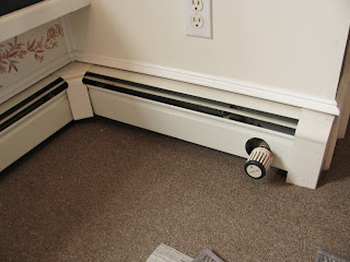
The dark green that continued into the bench just elongates the corner and throws it out of proportion to the rest of the room.  The red toile stenciling under the bench is too delicate for the green.  And what is up with that baseboard control sticking out into the room??

As with all problems, there are solutions!!


Solution #1....What is it?  Something my wonderful husband built that will add height.


Solution #2 - Fabric from one of my favorite manufacturers - DURALEE! This is a great linen and rayon stylized paisley fabric that will be added to "Problem Corner" to take your eye away from the issues and add a POP to the space.

 My favorite place to shop for Duralee fabrics?  The Duralee Showroom at the Boston Design Center.  Elena Pine and Gary Fisher  are my go-to people!  If a fabric is hard to come by, Elena will go out of her way to make sure you get it!  Gary is wonderful with Duralee's furniture line. Both are extremely knowledgeable about their products and always help you with whatever questions you have.   All of Duralee's products are top quality, and you get a lot of bang for your buck!  You can see some of their wonderful selection at  www.duralee.com. (And then call your favorite interior designer (ahem...) to turn that fabric into a fabulous item for your home!

Progress is being made!  Painting finished - check!  Rug installed - check!  Chandelier hung - ....no check.  Hopefully the electrician will be there tomorrow.  Only two more weeks to finish!
Stay tuned!

"Don't be pushed by your problems.  Be led by your dreams." - Unknown


Friday, June 7, 2013

SHOWHOUSE - GREEN VS GREEN

In my last post, the green was gone.  Well, temporarily.....  It was then replaced with GREEN.  Not just any green, but Benjamin Moore's Electric Slide Green!  I did the first coat, and boy was it GREEN!  I did a second coat and the GREEN took on a life of its own!  And then I started noticing people passing my space with sunglasses on....NOT A GOOD SIGN!!!  My space runs the gamut from very low light to "in your face blinding sunlight".  The green in the low light looked wonderful.  The sunlit areas brought out alot of the yellow in the paint and made it a day-glow color!  Painting 101 - light and surrounding colors will effect the color of the paint on the walls.  Also, I broke my own rule in choosing paint color - NEVER GO BY THE COLOR ON THE CHIP!!  I usually order several large samples of the paint I'm going to use and test it out on different walls in different lights.  I live an hour from the Showhouse, so decided to just wing it.  BIG MISTAKE!  But not traumatic!  The paint in the closet area stayed as is because I jazzed it up a bit.  Ok, more than a bit!  (But I'm not telling, yet!)  So off I went to my friendly, neighborhood paint store - Home Decor Group in Peabody, MA.  http://www.paintstorepeabodyma.com/  Home Decor Group is also a very generous sponsor, donating the Benjamin Moore paint Trio Design needed for our spaces.  They are extremely knowledgeable, helpful, and have a huge selection of paint and painting supplies.


My SCREAMIN' GREEN needed a little valium, so we choose a green with a tad more blue in it to balance all those acid-y yellow tones.

Here is a little before shot:


Of course what you are seeing is only as true as your computer screen, but trust me, sunglasses were needed!  Benjamin Moore's Stem Green added the right amount of "calm" to the paint.  Two more  coats later, (that makes 5 including the primer), I am finally finished painting!  Woo Hoo!!!! (Did I say that out loud?)  My hands won't move, but I am very satisfied with the results!

I'm NOT going to show you how the paint came out just yet, but I can't resist a little "tease"...


Stay tuned!

"If I keep a green bough in my heart, then the singing bird will come".  Chinese Proverb